Designing responsive websites that look great on mobile, tablet, destop and more.
One Site for All Devices
Everyday, the number of devices, platforms, and browsers used to view your site grows. Responsive Web Design (RWD) represents a change in how we build websites. Just a few years ago a common way of creating “mobile-friendly” website was to create a separate second one just for mobile users. In these cases website owners were left with double the maintenance work. Ick.
Talk to us about how your business can benefit from providing its customers a better mobile experience.
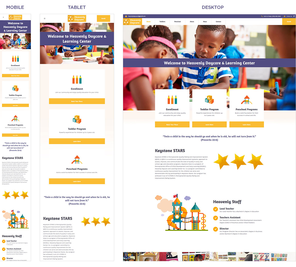
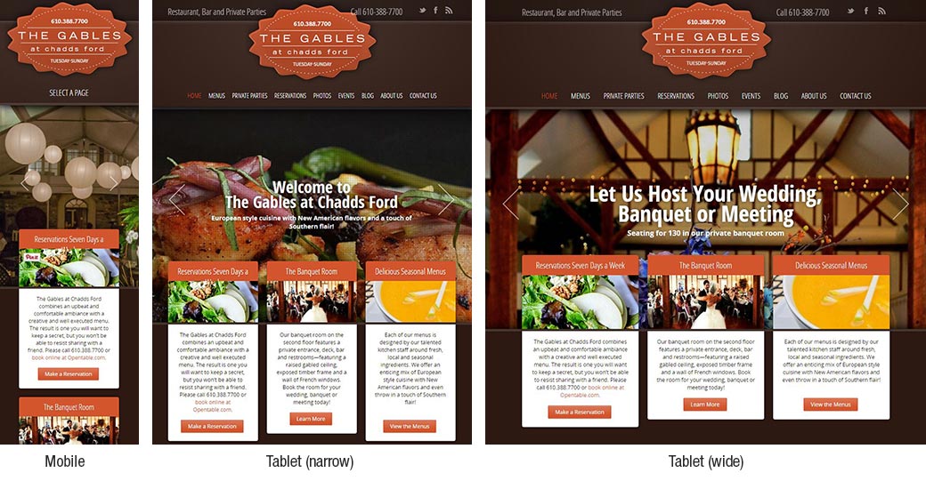
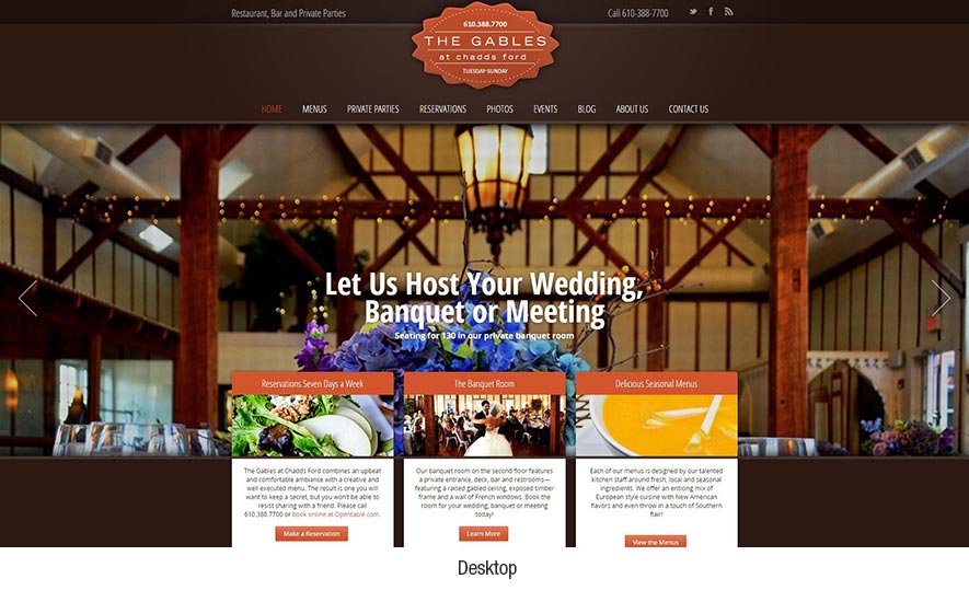
Responsive web design allows a single site to be served to mobile, tablet and desktop users. It accomplishes this by adapting its layout to the size of the device. For example, users on a desktop computer may see page content displayed in a three column format, users on a tablet a two column format, while mobile users would see the same content in a single column view.
Examples of responsive web design can be seen at mediaqueri.es. Our site was built using the same principles.